Case Study
Crafting a Qatar-compliant, robust UX/UI design for a payroll application for small merchants

Nexxo
Nexxo Ventures stands at the forefront of fostering innovation within the fintech sector, dedicating resources to nurture, finance, and support fintech enterprises poised for significant impact. Our mission is to empower entrepreneurs and business owners by providing them with the necessary tools and insights to turn their ambitions into reality.
With a strong commitment to innovation, Nexxo Ventures invests in fintech companies that not only offer ingenious solutions to pressing global challenges but also contribute positively to society. Our belief in technology as a force for disruption and improvement drives us to back ventures that promise to enhance societal well-being through financial technology advancements.
Industries
B2C, B2B, SaaS & Mobile software in Fintech.
-
Product thinking
-
UX UI design for mobile app
-
Improved UX design for SaaS product
Services we offered
Elevating from a basic tool to a comprehensive product experience
Before & After


Despite having a fully integrated digital portal for payroll, the rate of customers calling the call center for transactional queries remained high, becoming a bottleneck to scaling the customer base. As stated by the company's CEO, our clear UX goal was to minimize the load on customer support by:
-
Creating an easy single sign-on for streamlined login
-
Making the application user-friendly
-
Enabling payments in the fewest possible steps
-
Reducing the number of customer care calls
Challenges

To address the challenge of high call volumes to the customer support centre, our UX design team embarked on a comprehensive strategy that involved an in-depth operational workshop aimed at dissecting and understanding the nature of customer queries. The approach was methodical and collaborative:
UX design & approach
Our UX team organized a series of workshops and meetings involving the product manager and the operations (ops) team. The primary objective was to delve into the specifics of the calls received from customers. By examining these interactions closely, we aimed to grasp not only the volume but the essence of the queries, which would inform our design strategy moving forward.
01
Workshop and meetings:
Through these discussions, we meticulously categorized customer queries into distinct groups. This classification enabled us to identify patterns and commonalities in the issues raised by customers, providing a clearer picture of the challenges they faced while using the digital payroll portal.
02
Analysis and categorization:
A significant revelation from our analysis was the discovery of 'Black Box' processes within the customer journey. These were stages where customers lacked visibility into critical information regarding their employees' transactional activities and compliance status. This lack of transparency was a key contributor to the volume of calls, as customers sought external support to fill these informational gaps.
03
Identifying black box processes:
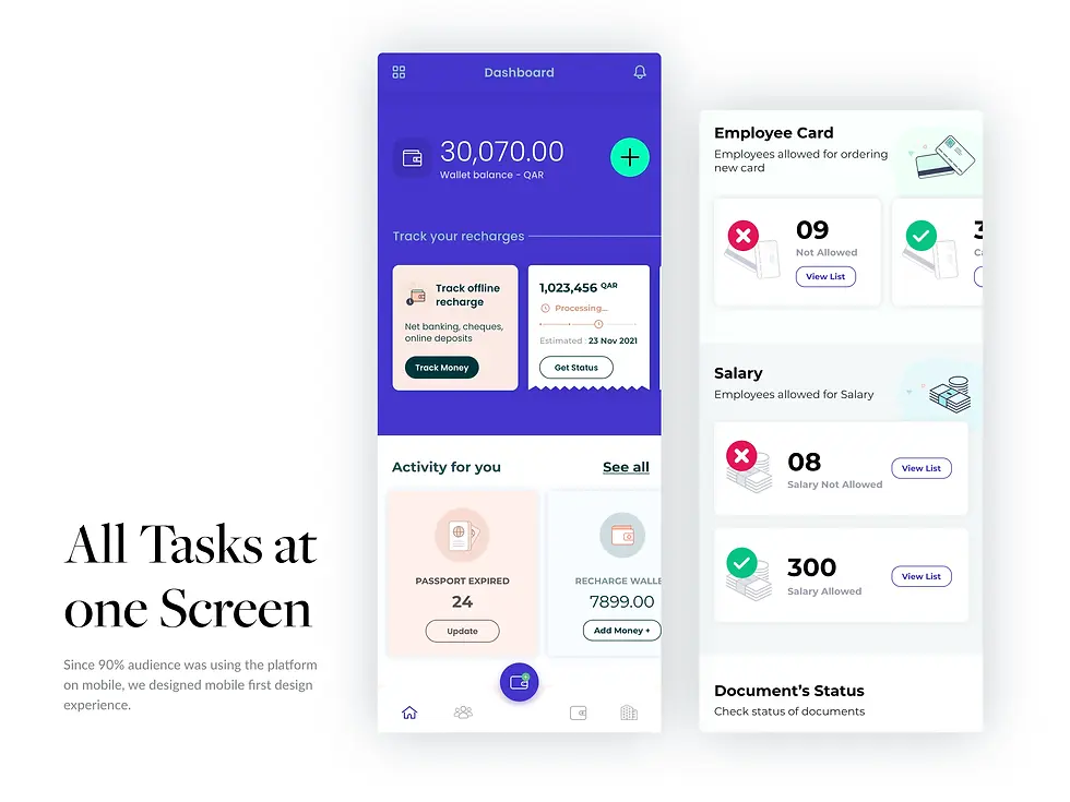
Armed with these insights, we worked closely with the client to devise a solution that would bridge this information gap. Our strategy involved redesigning the digital portal to make such critical information readily accessible to employers. By integrating features that allowed employers to easily view and understand their employees' transactional and compliance status without needing to contact customer support, we aimed to significantly reduce the reliance on call centers for such queries.
04
Enhancing information accessibility:

This solution was not merely about adding new features to the existing system but about rethinking how information was presented and accessed by users. By placing a strong emphasis on user experience and the intuitive presentation of complex data, we sought to empower users, enhance their confidence in using the digital portal, and ultimately reduce the operational load on customer support teams.
As part of our design solution, we developed low-fidelity wireframes to test and validate our design concepts. Our team designed a payroll app that enables end-users to efficiently manage and track employees' documents, payments, and recharges. Additionally, the app allows customers to process employee payments, create time logs, monitor recharge receipts, and check eligibility for payments and cards.
UX design & UI deliverables


The business and operations teams expressed satisfaction with the new workflows we developed. Collaboratively, we succeeded in significantly enhancing user autonomy by providing insights into transaction statuses, enabling automated ticket generation, and allowing visibility into employees' compliance eligibility. Although the exact percentage of call reduction remains unknown to us, the positive feedback from the teams indicates a successful implementation.
Impact
Ungrammary has a reputation for its approach. Their immersive POS and payroll portal designs have been released and are under development. Internal stakeholders are happy with their work. They maintain an effective workflow and a successful collaboration.

Gunnar Skoog
Chief Operating Officer

